Monday, October 3, 2011

Do typefaces really matter?


To most people, typefaces are pretty insignificant. Yet to their devotees, they are the most important feature of text, giving subliminal messages that can either entice or revolt readers, says Tom de Castella.

When Avatar, the biggest grossing movie of all time was released, one section of the audience was immediately outraged.

Graphic designers hated it. Why? They didn't like the font that director James Cameron had chosen for the subtitles.

"I hated it on the posters and then threw up a little in my mouth when I realised I would have to read that ugly font throughout the film in the subtitles," one blogger commented.

"After the hundreds of millions of dollars spent on CG effects, did he just run out of money for a decent graphic designer?"

And yet fonts are not just for geeks. Otherwise why would organisations around the world spend so much time and money changing their typeface?

A new look
In April, the Mail on Sunday reported that the Foreign and Commonwealth Office spent £80,000 changing its typeface to one that was almost identical.

Last month Gatwick Airport unveiled a new logo, replacing a rather austere style with a custom-made, handwritten script. A spokeswoman said the change was an attempt to emphasise the airport's "personal touch". And in the past week the BBC website has taken on a new look, replacing Verdana font with Arial (on PCs) and Neue Helvetica (on Macs).

But can different shaped letterforms really convey those values?

READ THE FULL ARTICLE

Thursday, April 14, 2011

Re vamping!

There's a stigma that a re brand or a revamp can be a pain in the arse! not always ;) let me explain.

The great joys of tweeting used to bewilder me and i only really started using it a few months ago, since then i haven't looked back. I have had numerous sales on my Folksy Shop and made some lovely tweet mates as well.

So while i was developing a website for Photoshoot Studiohire i was tearing my head trying to work out why i could not embed a video file to play on the website, so i put the tweet out!

I then received a tweet from Brian @ Crystal Networks who was kind enough to give up some of his time and help me along my merry way to frustration ville!

Anyway we got a bit distracted and started chatting about my website and how SEO and Website user NOT friendly is had become (i made it 3 years ago!) so it was clear it was time to to update it.

Budget being incredibly tight i was surprised to find out how much (or little) the website would cost me!

So why the re vamp???

It's important in a job like mine to keep on top of trends and changes and it my old website was "so last year" so for me to look professional and attract the types of clients outside of my that i want to then i had to take the jump. It was wort every penny, every email and every tweet!

Don't think twice about it, if you have already thought re vamping then that seed is clearly telling you you are not happy with how things are for you at the moment, so make the change!

I am so glad i did

For £599 i got a brand spanking, shiny and wonderful website with ease of access for me to go in an design elements as well, i have full control over the website and don't have to keep back to Brian (unless i really have to!) thus enabling me to feel mighty intelligent and clever about all things web and my site.

Tuesday, March 8, 2011

1st year anniversary Giveaway

yes it's that time already and to celebrate a fantastic year with u all i want to give away....

£30 worth of graphic design!!!

Just leave a comment below as to why u would love a Bonnita Makeover. There is a week to enter and the winner will be announced next week! Tues 15th March @ 6pm

Please only enter if you need a makeover or feel u could benefit from my talents.

Good Luck!

Monday, February 28, 2011

Time for Tips!

Ok the first of my tip blogs with questions and queries sent by u!

This post will be advising on a couple of cameras that you own and how to improve those photos not just for folksy but in general. Some very useful tricks and tips for u all.

Wendy of Madbags advised me she had a Hitachi HDC-756E


So believe it or not i couldn't even find an online manual for this camera! so what i advise will be off my own experience with compact digital cameras.

"The photo was taken with a small compact - Hitachi HDC-756E. I used the macro setting and cannot remember if the flash was used."


Just to make u all aware for those who didn't know, while your camera is in Macro setting it won't allow Flash, the same goes for sports settings, this is because it requires the lens to be open at different times than normal. So only use macro when your natural lighting is good. if possible take ur photos as close to a window as possible also choose ur backgrounds wisely as they can cause a lot of headaches while trying to get the products look fab!

Here is a before shot of a bag that Wendy sent to me what u will see over the next few images is what i would do to improve it.


I am cert not saying the photo is bad! as for a compact with no flash it's not bad at all!
Below are 2 techniques that can be used to lighten up images without over saturating them, further info can be obtained my message me at my shop Bonnita Graphics

(click to enlarge image) This was done in photo shop but the principles work in most photo editing software


Option one is to completely cut the background out giving u a magazine feel to ur images it's takes some practice to get the curves and image looking right but it an produce some lovely results

Option 2 is to adjust the exposure levels, have a look left, as i said i can explain in more detail if u are not sure just message me. It;s a good way for u to identify where the issue is, over or under exposed.

It wont get rid of the background unless u shot in white in the first place! this is the kindest way to adjust the background brightness without over exposing the product and making it over saturated.


The next email was from Gracie who in my humble opinion doesn't need help! There really isn't a lot i could say other than, be carefull of opposing colours in ur background.

On the left is the original on the right is my take on what may look better, the less pink helps the green pop imho. This was done using the levels technique i showed earlier and then in the image settings taking some of the red out.


Bev @ Bits and Bobs sent me a great example that i can solve fairly easily with technique but not with photoshop, this is an issue that can be solved with camera options

"I use an HP CB350 camera, 12MP. A friend has helped me set it up and the only pics I can take what don't take on a pink tinge are on an intelligent setting but this doesn't allow me to use the little flower setting that brings out the detail in my work."

here is the image i was sent


Now u can't see very well from this size image but it suffering from a bad case of noise.

Noise is the silver particles that are in the camera and when Lighting is low your camera (if on Auto) will up up it's ISO to allow more light to flow through the lens, the down side to this is it hits these particles and creates noise.


There are 2 simple ways to solve this issue.


the first one is (if the camera allows) to change ur ISO setting to no more than 200. I wont go into detail about ISO as we will be here for some time!

If you still have problems or photos are too dark, take them outside or on windowsill, the more natural light u can get on the product the better.

If you want to try and get that stitching detail wack it on macro and make sure u have a good light source.

So there u have it some tips that i hope will help u create better images for your beautiful products.

Think about what makes u buy a product that you see in a magazine, lifestyle pictures can really help set a scene and play on people emotions which is a massive factor when buying, how a product will make a person feel will help them decide whether to buy or not!.

Sunday, February 20, 2011

To Create or not to Create!

Hi peeps and welcome to my new long time coming post.

This probably sounds a bit of an odd subject but it is something that is really close to my heart.
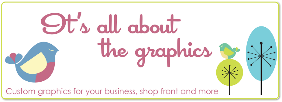
Branding!!!

I have a shop on the wonderful Folksy and am immensely proud of all the hard work i have put in for my shop to do as well as it has it little under a year.

Last year i Graduated with a 2:1 BA Hons in graphic design and have over 5yrs experience in dsign, now i know some people can fluke their way through these things but i a pretty sure i know a bit of what i talk about, SO...

Self made banners and branding is my subject and i would LOVE to know what you think.

My services are not expensive but shops and business that are starting out can't always afford the expense of professional branding, which i totally understand and can empathise with.

I may have a little shop offering products and very low prices (and i say low as most don't even cover minimum wage!) but i also do A LOT of work for companies outside of folksy, i am talking about companies that work along side councils, Financial companies, musicians and many more who cannot afford to have bad branding.

I have a great friend who owns a Photographic Studio who was subject to this, and after a few conversations he could see where i was coming from, the downside is that he was already half way through and had already got some bits printed, so we are starting from scratch but he needs it and the great thing is he is so open to it and understands that the company needs it.

Of course with small and many home run business money can prevent such luxury's as high end branding and becuase of this i am going to give u some pointers to think about if u are going to DIY it.

1. LOGO - For me this is the first thing i work on in any project, that is of course if u have a name already! Once u have got ur logo most things will flow from there.
Consider that people will get to know your shop by ur logo. Really think about what you want ur logo to say about u, and dont be overruled by the obvious, your company name might be Orange Moon but u don't have to have an Orange Moon as ur logo, think out of the box, this Will help you stand out from the crowed. Look at Nike, just a tick but u know who they are.

2. Shop Banner - This of course is down to personal preference. I am a stickler for good presentation and a bad banner and branding has made do a 360 out of a shop more often than not. Even the most technical of people may not have the eye or skill to create a good design for their shop. You wouldn't try and wallpaper a room if u had no idea what u were doing, the same can be said about design, a great design is usually made up of simple rules that Joe Bloggs wont know about.

If you are still wanting to have a go: Use good quality images and make sure u are allowed to use them. Make your name nice and clear so they can see it without looking to hard. Eye catching and simple can sometimes be the best.

3. Business cards - Think HARD these are going to represent you. The main details u need on them info wise - Company name, Email, Web address. You don't have to have personal address's and telephone numbers.

Use your logo and keep them clean, easy to read and interesting business cards can make people keep them in their wallet and be reminded of you.

This is going to sound really harsh but hey "trust me i am a designer" self branding if you truly don't know what ur doing can be disastrous. Is £7 really to much to pay for a professionally created banner?

I try and be honest with feedback if asked for my opinion ad i will say if it not as good as it could be!

I appreciate that there are tutorials and easy ways to make banners and branding, but please if you take your business seriously consider a professional, doesn't even have to be me! i am not the only bod available.

I would love to know what some of you think about the above, i look forward to reading the comments